

More than a new logo - a brand built around people, purpose and outcomes.
Project Overview
-
The Nowra Chiropractic Centre had something genuinely rare - a clinic that truly cares. Their chiropractors are exceptional at what they do, but none of that was visible from the outside.
Like many small businesses, The Nowra Chiropractic Centre had a logo - but not a brand. The two are very different things. A logo is a mark. A brand is the sum of everything a business stands for, communicated consistently across every touchpoint. The Nowra Chiropractic Centre’s existing identity was outdated and doing none of that heavy lifting.
The turning point came when Chiro Katrina listened to a podcast about the importance of branding and had a moment of honest recognition they didn't have one. More than that, they weren't entirely sure what branding really meant or what it could do for them.
That's exactly where we come in.
We took them on a journey - through their strengths and weaknesses, their values and ambitions, their patients and their competitors - to uncover what made Nowra Chiropractic Centre genuinely different. Not what they thought they should say, but what was already true about them, waiting to be named.
That journey started, as it always does for us, with strategy.
-
Katrina and Harry came to us as two exceptional chiropractors - brilliant at what they do inside the clinic, and completely new to the world of branding. They had never thought about brand values, tone of voice, or how they wanted their patients to feel. They just showed up every day and did exceptional work.
Our job was to help them see what was already there.
Through our strategy sessions, we asked the questions most businesses never stop to answer. What do you stand for? What do your patients feel when they leave? What do you want to be known for in five years? What makes you different from every other clinic in the region?
What emerged was remarkable - and it had been there all along.
Two chiropractors who genuinely believed that every patient deserves to feel seen, heard and valued. A practice built on precision, care and a quiet but fierce commitment to doing things properly. An ambition not just to be good, but to set the standard for their entire profession in Australia.
From those conversations, we built their brand blueprint - a strategic foundation that defined their values, their goals, their tone of voice and the feeling they wanted every patient to walk away with.
That blueprint became the brief. And the brief made everything that followed possible.
-
During our strategy phase, one insight changed everything.
Most people visit a chiropractor reactively - when something hurts. Yet those same people will regularly service their car, wash it on weekends, and fill it with premium fuel without a second thought. They want their car running at its best.
So why don't we do the same for our bodies?
We'll spend freely on maintaining a machine, but wait until we're in pain before investing in the one thing we actually can't replace.
This reframe - from pain relief to proactive body maintenance — became the foundation of everything that followed. Nowra Chiropractic isn't just fixing problems. They're helping people to be their best at every age.
-
We built the Nowra Chiropractic brand around two distinct archetypes: 70% the Sage - authoritative, knowledgeable, evidence-led - and 30% the Magician - transformative, precise, quietly remarkable.
That combination says: we know exactly what we're doing, and it will change how you feel.
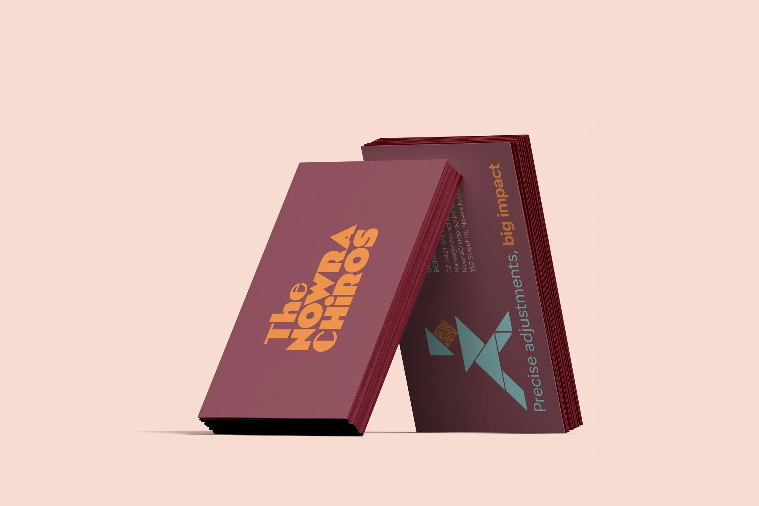
We also made a strategic decision to split the brand into two expressions:
The Nowra Chiropractic Centre — a professional, credentialed voice for B2B relationships, referrers, and the broader health community.
The Nowra Chiros - a warm, human, accessible identity for patients and the local community. Katrina and Harry are the what the brand is about.
Same values. Same care. Two voices, each speaking directly to the right audience.
-
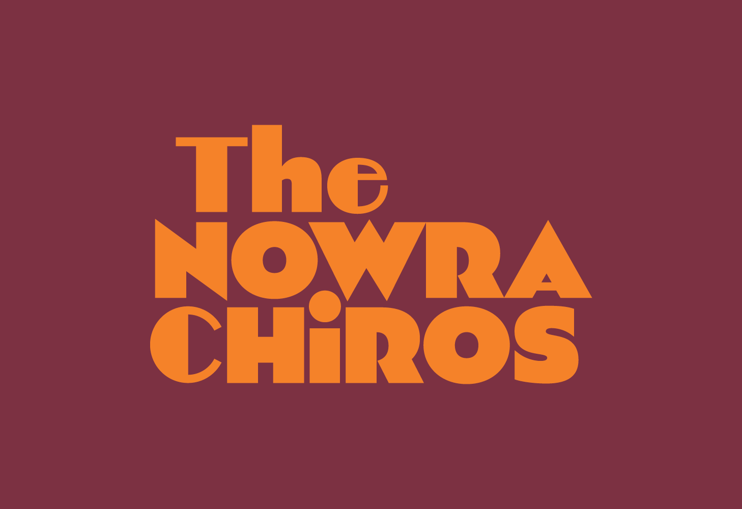
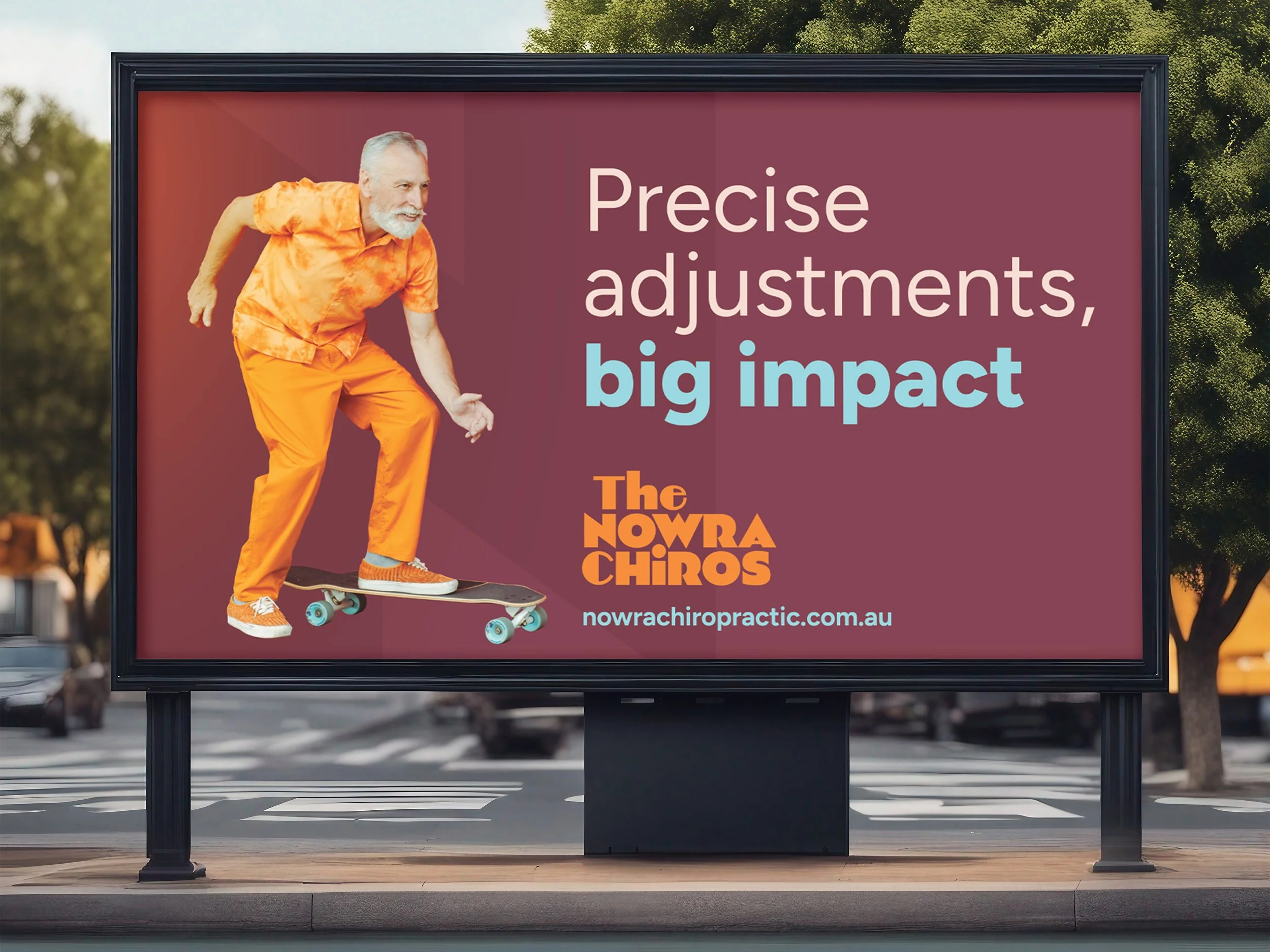
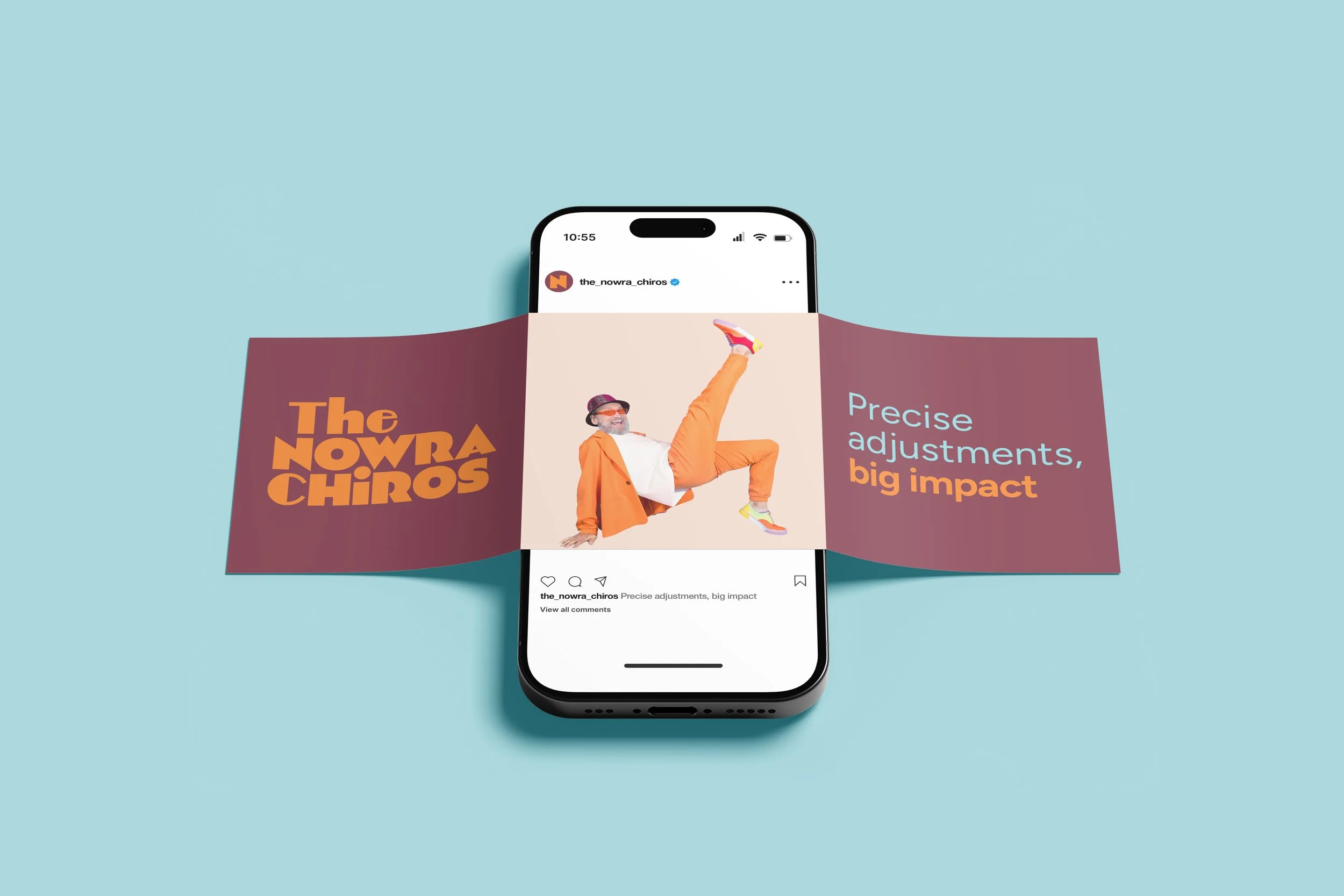
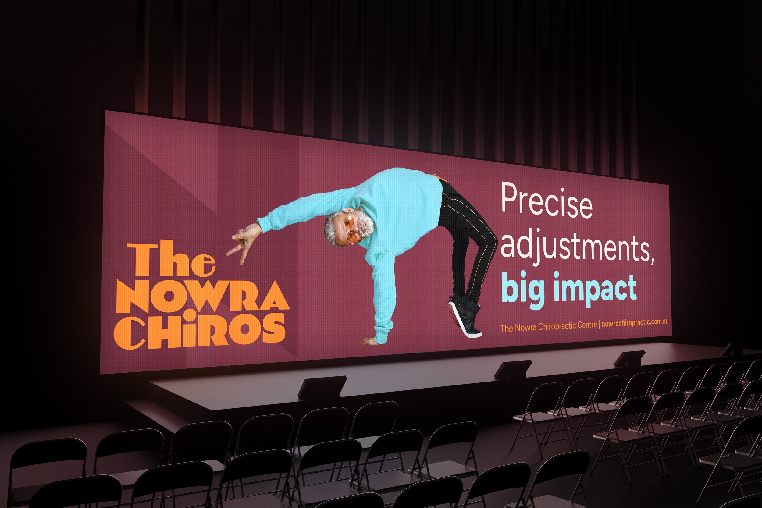
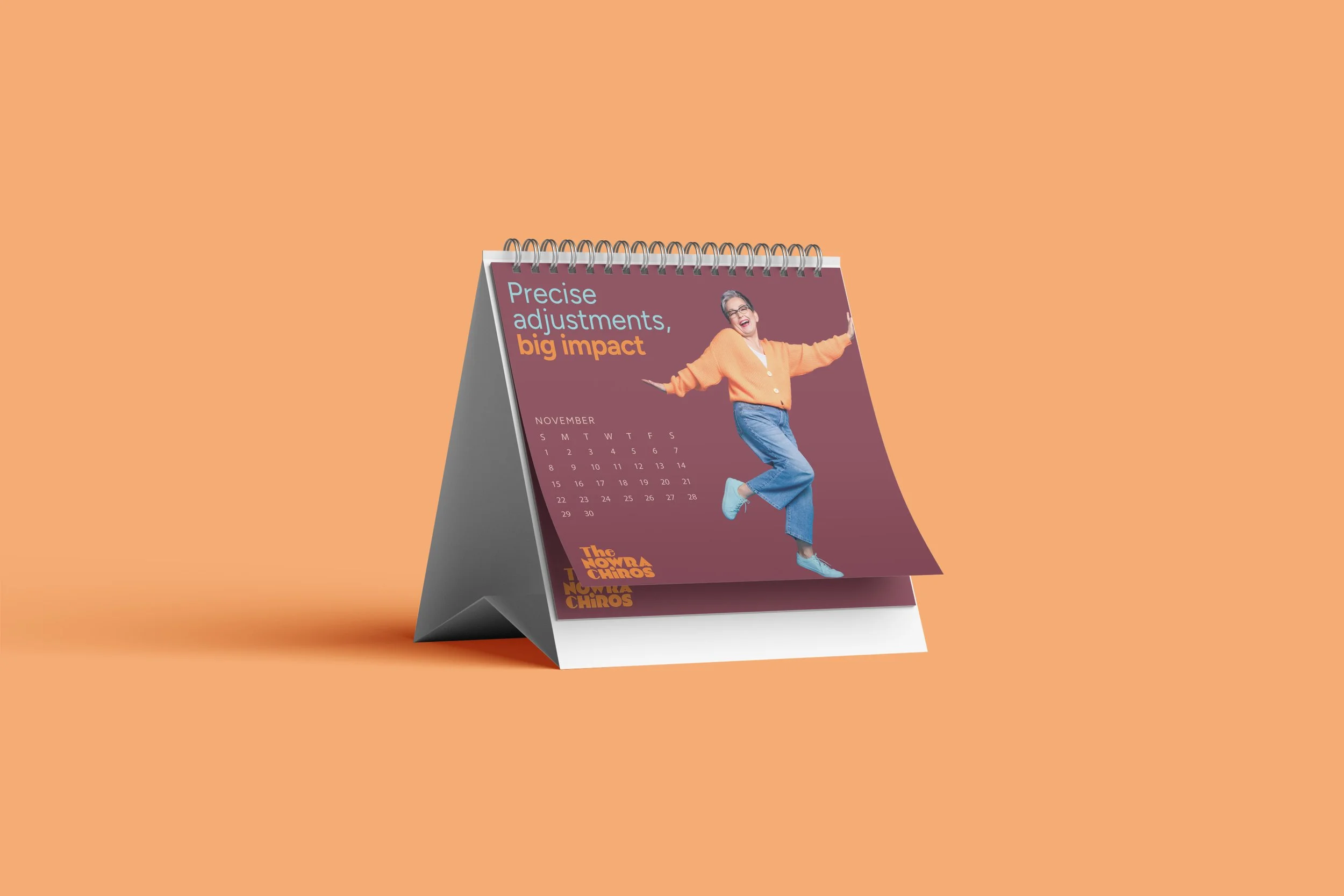
The tagline came first. And once we had it, everything else followed. Precise adjustments, big impact. Those four words didn't just capture what Harry and Katrina do — they became the entire creative system. Precise told us the brand had authority, expertise, and zero tolerance for guesswork. Big impact told us the visual world had to be joyful, unexpected and impossible to ignore. The creative brief was simple: show people at their absolute best. Not spines. Not pain. Not clinical white rooms. Real people, across every age and stage of life, doing things that make you stop and smile. An older man in a fun on-brand orange outfit riding a skateboard, grinning like he owns the street or a young guy suspended horizontally above the floor mid-breakdance, staring down the lens. Every image is a different person, a different age, a different kind of movement. But every image says exactly the same thing: this is what your best looks like. This is what you're keeping yourself able to do. New images can be added over time. New people. New activities. New moments of someone living fully. The palette itself does heavy lifting. Deep burgundy grounds the brand with authority. Warm orange brings energy and warmth. Blue adds the magic - modern, confident, a little playful. Together they feel nothing like a healthcare brand, but represent the brand personality. That's design working exactly as it should.
-
The Nowra Chiropractic Centre now has a brand that reflects exactly who they are - and who they intend to become. Where once there was an outdated logo and no clear identity, there is now a complete brand system: strategy, values, tone of voice, visual identity, colour palette, typography, imagery direction and a dual-brand architecture built for both their patient community and their professional peers. Harry and Katrina came to us as two exceptional chiropractors who had never thought about branding. They left with a blueprint for how their practice communicates with the world - and the confidence to use it. They have now become one of the most articulate brand champions we've worked with. They understands not just what the brand looks like, but why every decision was made.
This is a brand in its early chapters. The five-year goal - to be the benchmark for chiropractic care in Australia - is ambitious. But a practice led by two people with this much expertise, this much care and now this much clarity about who they are? We'd back them.